
IDEA – LOGO
Authors: Erasmus+ program students
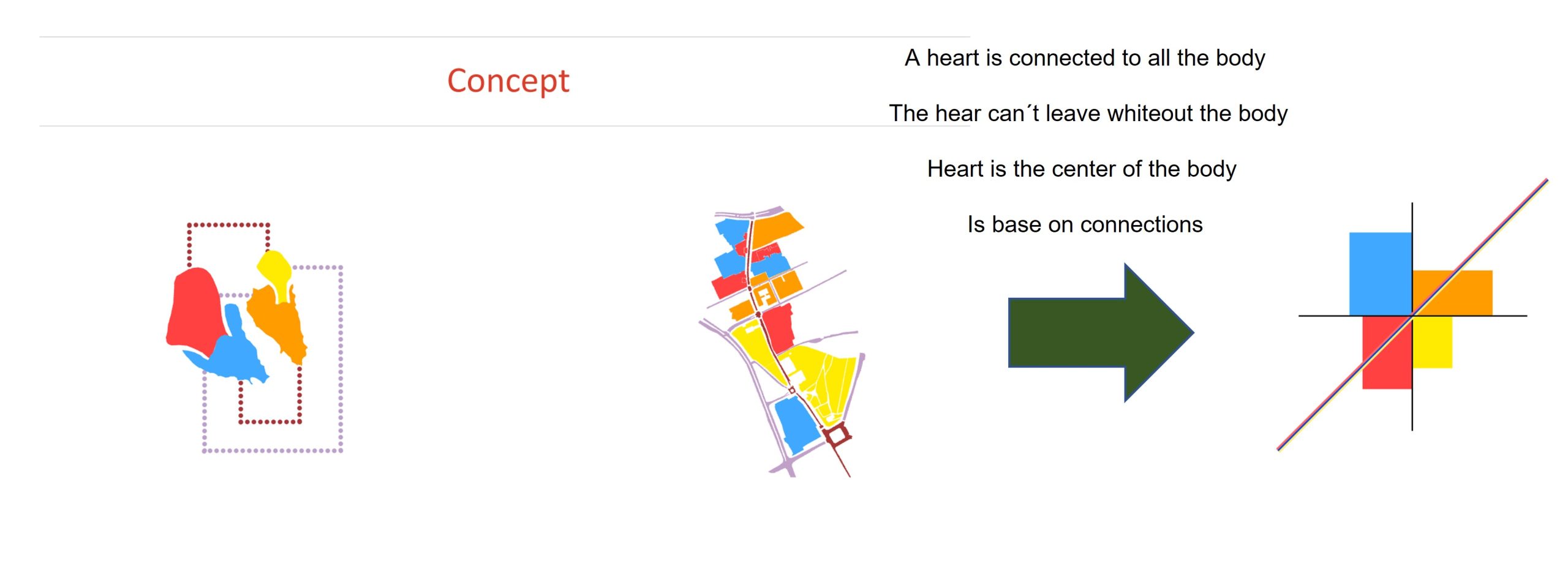
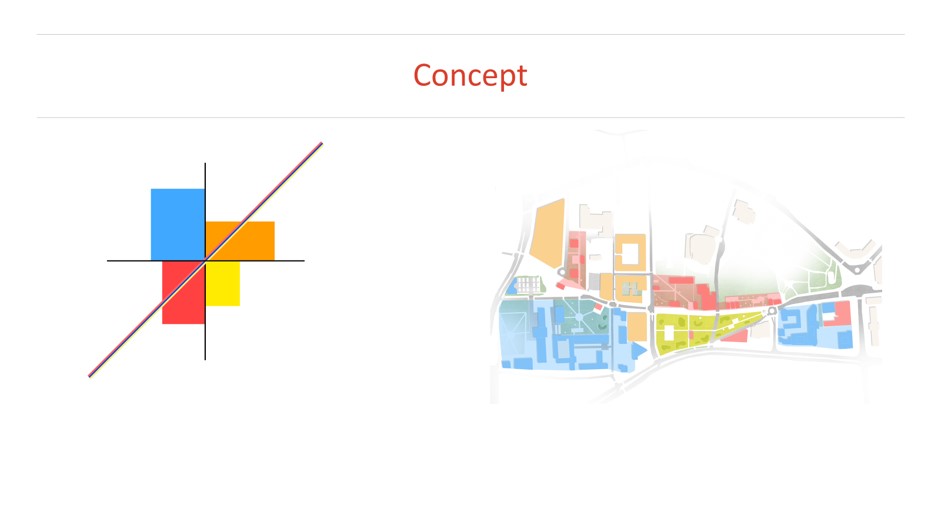
In the example posted above, the students linked the city center area to the heart, the ‘heart of the city’. They linked the functional-spatial and communication layout that emerged during the analysis phase. They have written it into the approximate shape of a heart with a clear nodal point. This is how a graphic logo was created, reflecting the schematic situation in the space of Bialystok with an ideological layer about the functional significance of the place.
Example of BUT students ideas
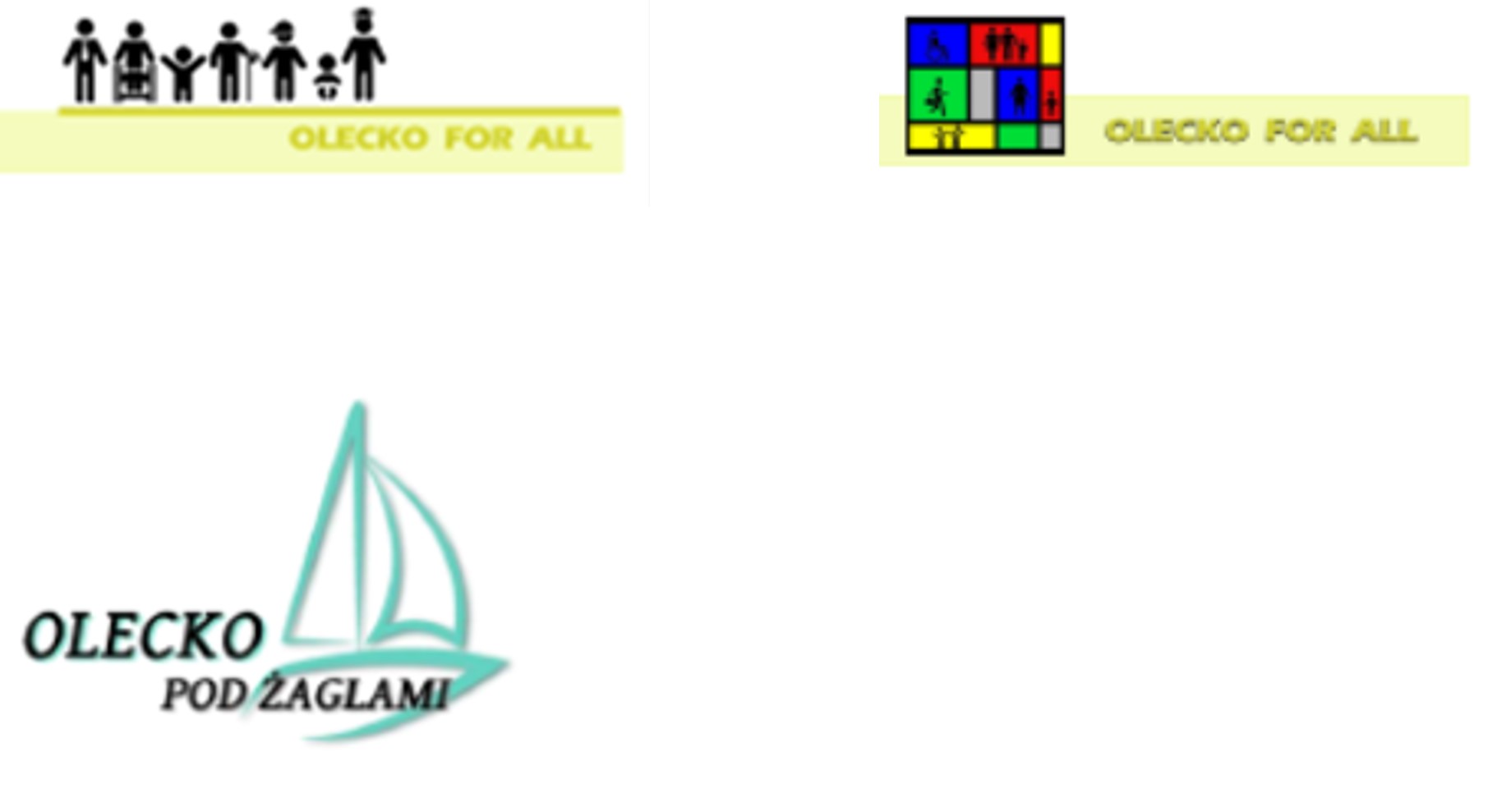
Works or logos by BUT students who developed the centre of the small town of Olecko in the Mazury region. Here we have a different approach, Olecko for all, defined the need to create a space attractive to all inhabitants of the city and we see two different ideas for the same idea. A different approach was presented by the group that wanted to refer to the tourist importance of the town. Olecko under sail, was an interesting inspiration for linking the city centre with the nearby lake and its attractions. Ultimately, it was also interestingly reflected in the architectural solutions proposed by the authors.
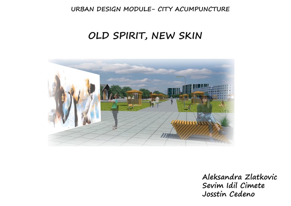
Authors: Erasmus+ program students
The final work is the traditional slogan ‘old spirit, new skin’, referring to the historical and cultural values of the place, but at the same time seeking a contemporary setting in the proposed design.
 Authors: BUT students Emil Ostrowski, Wojciech Trochimiuk
The idea of your project should respond to the main problem or group of problems identified in the synthesis of proposals. This is a clear signal to the viewer of a consistently carried out analytical process and the ability to creatively find answers to the problems posed in the first part.
Summary
The possibilities are many, the logo is not just a marketing gimmick. Often in the course of design work, as the idea develops, the clarity of what was there at the beginning is blurred. It is then also good for the authors to be able to recall the main idea behind the design.